Dog Blog Post #256:Actually, the Daily Shoot for today was:
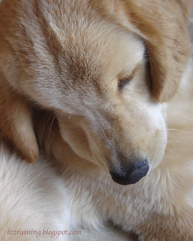
Make a low contrast photo today. Concentrate on other cues—such as line and texture—to create your photograph.
BUT
I feel free pretty safe saying the resulting picture came out "Soft and Sweet". :)
So I did not break out the backboard for this one, nor did the stretchy black velvet fabric make an appearance. This was shot flat on the ground, no backboard at all, on the ultra-soft (human) blanket (not that you can see much of it.)
Missing Skill of the Day showed up really fast, as I wanted to have the boys curled up together in some fashion, and I could not get them stay were I put them. Haven't a clue why, it just wasn't happening.
Plan B: Booted Henry out and focused on Zachary. Actually, I didn't focus on Zachary, as it turns out he was the source of the fidgets.
(sigh)
Plan C: Booted Zachary and focused on Henry, who was the model, well, model! He was so good at following my nose magnet (aka cookie) that I was able to contort him into the fuzzy knot you see above.
Good Henry! Here's a cookie (or 2... probably more like 20!)
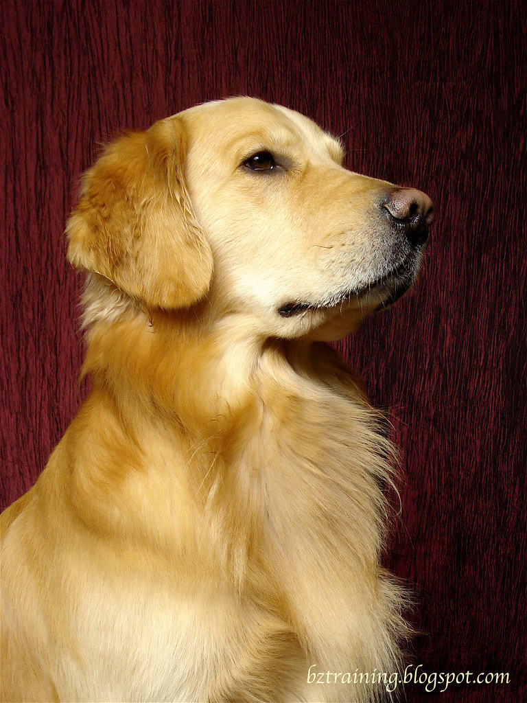
 Later on, I did pull out the backboard and a wonderful new piece of burgundy(?) fabric I bought last week but haven't had a chance to try out. Once again, I had no trouble with lighting/color, and I'm beginning to wonder what gives, as I don't think I've changed anything, and yet pictures don't lie (at least not ones that haven't taken a spin through Photoshop!)
Anyway, Zachary was totally "on", which was a good thing, as Henry suddenly decided the baby-gate that blocks the end of the "set" was a Scary Thing (probably because his klutzy mom backed into it... twice... causing it to make horrible sounds as it hit the ground) and was a total write-off.
His picture did get a minor color/brightness/sharpness boost in iPhoto, than bit of cosmetic surgery in my fake PhotoShop (ImageReady? - we still haven't located our real PhotoShop) using the little stamp tool to obliterate much of the rather prominent fold that runs right down the middle of the fabric.
I don't think the background color of my blog does the picture any glory, but if you click on it, you'll bring up the original flickr image. And if you click on that, you'll see it in lightbox, which I think looks much better. :)
(Yes, I do own an iron, but I'm pretty sure I haven't use it since before my now-driving son was born and I'm definitely not feeling inspired to break my non-ironing streak just for this.)
Hmm... what else? Oh! I'm reading a new book - Digital Photography Composition for Dummies.
Yes, laugh if you must, but I'm finding it full of useful information and I can't wait to try out some of the things I'm reading about.
Editor's Note: for the record, it appears Henry has indeed forgiven me yesterday's transgressions after all. Whew! At the moment he's curled up at my feet. :)
© 2011 BZ Training - All Rights Reserved
6 comments:
Awwww Zach looks so sweet...
You dogs are wonderful posers!
Isn't it the silliest things that are "scary"? I brought out the green bin (yard waste) yesterday and Sage hid behind a trellis.
Henry looks so sweet and Zach is very regal. What great poses!!
I agree, it does look better on a dark background, but it looks great on the light grey, too. The first one is great!
I need Photoshop for Dummies! :P I can't do anything with it!
Love the burgundy backdrop. So dramatic and with such a great model!
Wyatt
The contortions your pups get into for cookies crack me up. My dogs don't fold so well. :o))))
Post a Comment