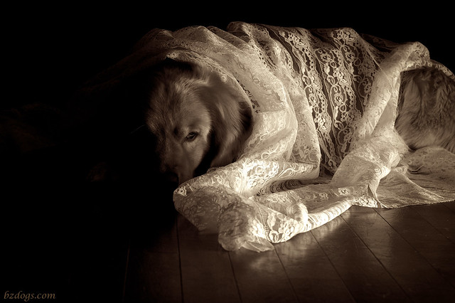
 |
| Henry Flash on the floor on the right, facing away and bounced off the cabinets. Anti-reflector* on fridge to left. |
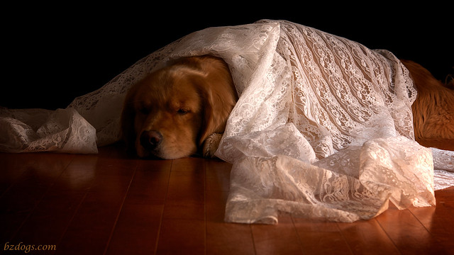 |
| Henry Flash on the floor on the right, facing away and bounced off the cabinets. Reflector on the fridge to left. |
 |
| Henry Flash on the floor on the right, facing away but bounced higher (off the dishwasher). Reflector on fridge to left. |
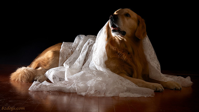 |
| Zachary Flash on floor on the left, facing away and bounced off reflector on the fridge (also on the left). |
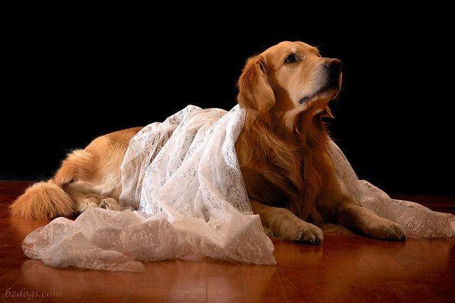 |
| Zachary Flash on floor on the left, facing away and bounced off reflector on the fridge (also on the left). Flash further from the reflector than above, so light is gentler. |
Dog Blog Post #1305
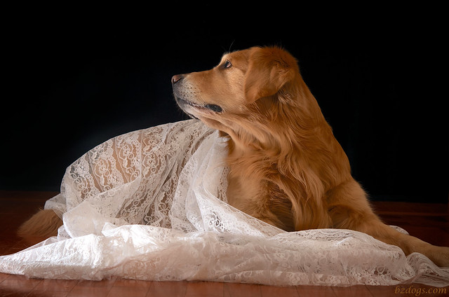
I suppose I can take some comfort in the fact I discovered 48 ways NOT to take a good picture a dog, a piece of lace, and "unusual" lighting.
* Anti-reflector: My normal silver round reflector turned around so the black side is facing the flash. Why? So the flash (typically on the opposite side of the room and pointed toward it) can't reflect off the white refrigerator, to which the reflector is clipped, so I get nice dark darks on that side of the picture.
** 48: For comparison purposes, that's about 4 times the number of pictures I shoot on a typical day, and doesn't count the dozen or so non-starters trying to shoot through the curtain taken before I even tried adding a dog.
Which is the Best Bad Idea?
I picked the top shot, as I liked Henry's pose and expression. Switching to sepia overcame some of the lighting shortfalls, as I could adjust things a bit without turning Henry an unhealthy shade of orange.
Photography Assignment
Daily Dog Challenge 814. "Play With Light"
Our Daily Challenge - January 22, 2014 - "Patterns"
Heartbreaker Shot
Love Zachary's pose here…
-- Like the idea of a daily dog photography prompt? Click on Daily Dog Challenge and join us!
© 2013 BZ Dogs - All Rights Reserved
3 comments:
Love the light and shade. How clever. Have a tremendous Thursday.
Best wishes Molly
I think I like them better than you do, but I don't know what your vision was for how it would look. I love it in black and white and the lighting is exquisite!
I'm a bit partial to the 4th photo, but loved them all! Good use of 'unusual' lighting.
Post a Comment